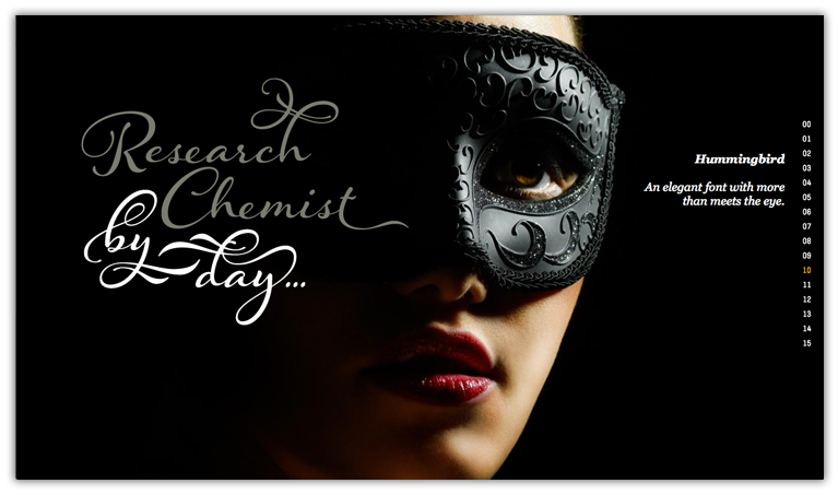
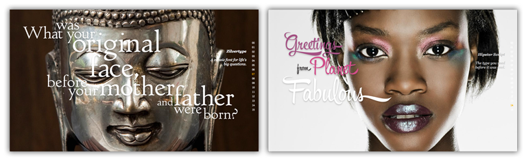
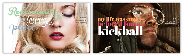
Type:Face
Veer needed a promotion to highlight new typeface offerings while at the same time highlighting the scope and quality of their existing photography. I created a parallax-scrolling display that matched each font with a close-up face image. The mood created by the mix of the type and image was reflected in the display message. The subhead extended the comparison and linked to the font sales page.
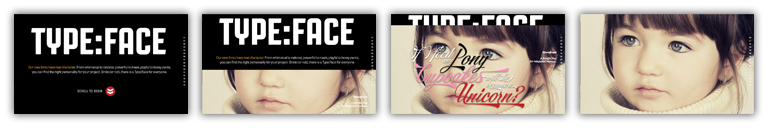
"Our fonts have real character. From whimsical to rational, powerful to meek, playful to bossy pants,
you can find the right personality for your project. Smile (or not), there is a Type:Face for everyone"
ART DIRECTION | CONCEPT | DEVELOPMENT COPYWRITING: ELI BARACH, BETH YOST